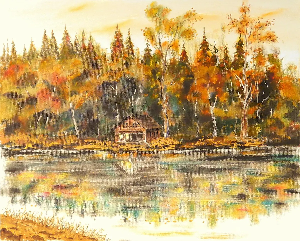
A photograph of a canvas is often the first version of your work anyone sees. If the colours drift, the surface glares or the edges taper inward, the painting is judged on the photograph rather than on itself. Canvas brings two complications that paper does not: a woven texture that catches light, and a surface that is rarely perfectly flat. Both are manageable once you decide what to control and what to leave alone.
Set up a space you can repeat
Consistency matters more than expensive equipment. A blank wall with a neutral backdrop, no direct sunlight and no overhead spotlights will beat a studio full of gear you have to reassemble every time.
Hang or rest the canvas vertically — on a wall, an easel or a sturdy stand — and bring the camera to it rather than the other way round. Put the camera on a tripod, set the height so the lens sits level with the middle of the canvas, and check that the canvas back is parallel to the camera sensor. The grid overlay in your camera or a spirit level app will tell you quickly whether you are square.
Fill the frame with the artwork, leaving a narrow margin on all four sides. That margin gives you room to crop precisely later without clipping the painted edge.
Light the canvas softly and evenly
Two lights of the same type, placed at roughly 45 degrees to the canvas and the same distance from it, give you even coverage with no shadow down one side. Diffuse them — softboxes, umbrellas, or even a white shower curtain taped to a frame — and keep both lights at the same height as the centre of the painting. If you are working with daylight, an overcast day against a north-facing wall is close to ideal; bright sun is not.
Turn off mixed lighting. A tungsten bulb on one side and a window on the other creates two colour temperatures that no white balance setting can resolve properly.
Getting rid of glare
Gloss varnish, oil paint and metallic pigments all reflect. What you see is not the light itself but light bouncing off the surface and into the lens. Move the lights further to the sides, raise them slightly, or tilt the canvas a degree or two forward — a tiny angle is invisible in the final shot but often removes the hotspot entirely. Look at the canvas through the viewfinder and move one light at a time until the bright patch disappears.
A polarising filter on the lens reduces reflections further. With polarising sheets over the lights as well — a cross-polarising setup — you can remove surface glare almost completely, though it takes experimenting to keep the texture from flattening.
Get the colour right at the source
Set a custom white balance using a grey card held flat where the canvas will be, or shoot one frame with the card in it and correct later. If your camera records RAW files, use them: they hold far more colour information and give you room to adjust without the image falling apart. Photograph the grey card once at the start of a session, and keep your lights and settings unchanged across a series so the whole collection looks consistent online.
Angles, framing and texture
Shoot the main image dead-on. Even a slight angle introduces keystoning, where one edge looks longer than the other, and no amount of editing fixes that cleanly.
- Keep the camera level with the centre of the canvas and square to it.
- Use a lens around 50–85mm equivalent if you can. Wide-angle lenses bow straight edges outward.
- On a phone, step back and use the 2× lens rather than moving closer with the standard one.
- Check the edges on your review screen: painted sides should stay parallel, not lean inward.
- Take a second, raking-light detail shot if you want to show brushwork — but keep the master image flat and even.
Edit for accuracy, not for drama
The job of editing is to make the file match the painting, not to improve the painting. Correct the white balance, straighten the crop, and apply only modest adjustments to brightness and contrast. Canvas texture tends to look sharper on screen than in life, so resist heavy global sharpening; a small amount of capture sharpening is usually enough.
Compare the screen image with the physical canvas side by side, ideally with daylight behind you and the screen brightness turned down a little. Study one colour at a time — a difficult green, a warm grey — rather than judging the whole image at once. If your monitor is uncalibrated, your edits may exaggerate a difference that is not really there, so treat any large correction with suspicion.
Prepare files for print and web
Keep a master file and export copies from it. The master holds everything; the exports are disposable.
- Save the master as a TIFF or PSD at full resolution, in 16-bit where possible, with no cropping or sharpening baked in.
- For print, supply a file sized at 300 pixels per inch for the actual print dimensions, in the colour space your printer specifies.
- For web, resize so the longest edge is around 1500–2000 pixels, convert to sRGB and embed that profile.
- Export JPEGs at high quality — around 85–90 — which keeps detail without bloating the file.
- Check the result on a phone as well as a desktop. Most gallery browsing happens on a small screen.
Name files so you can find them later: title, size, version. And back the masters up somewhere other than the computer you edit on.
A last check before you pack away
Zoom in to full size and scan the edges, corners and surface for dust, stray hairs or a reflection you missed. Then step back and look at the image whole, next to the canvas itself. If you can glance between the two without the colour jumping, you have done the job. It takes an hour or so the first time and much less once your setup stays in place — and it means every photograph you post or print shows the painting you actually made.
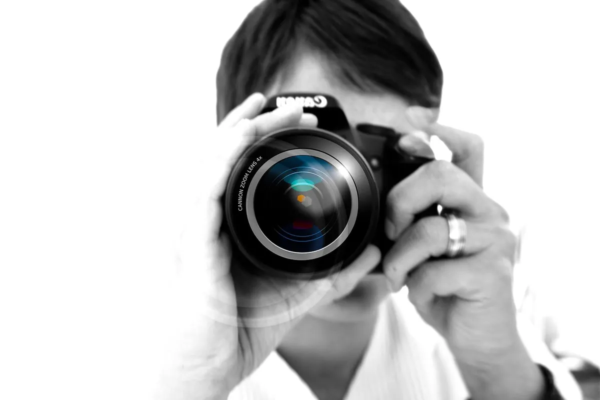
Photo: geralt / Pixabay